Three layouts that work in residential space
Three spatial logics architects recognise immediately, and investors often skip.
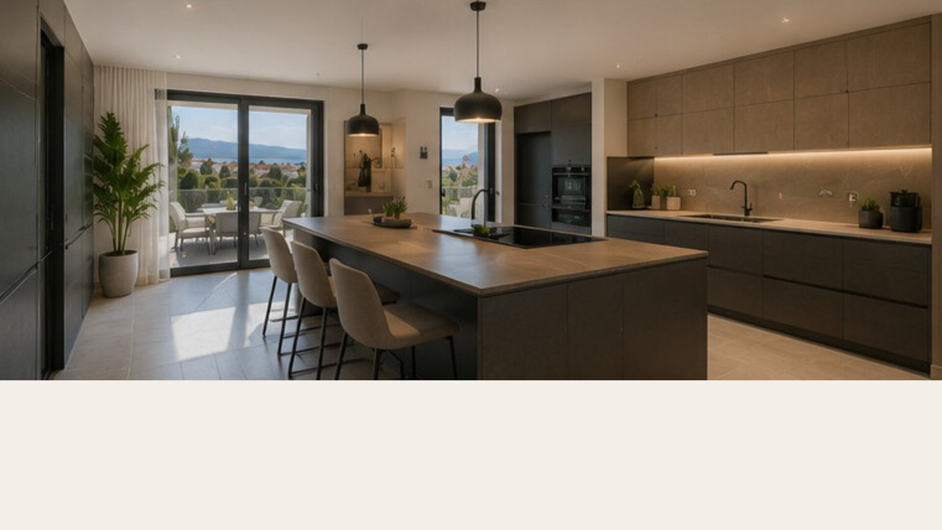
Three layouts that work, and why.
1. Entry as filter, not room. Entry should slow and direct, not spend area on "representation" used once a day. A well-filtered entry makes the rest of the house feel larger without increasing footprint.
2. Public to private in three steps, not one. Living, service, and sleeping zones need clear transitions. When everything opens into one flow, the house becomes tiring for daily life, regardless of photography.
3. Service on the perimeter. Technical and service spaces (bathrooms, wardrobes, storage) most often work on the outer edge or along a service tract, not in the centre of living space. That is building logic, not aesthetic dogma.
Proportion is not "room size". Proportion is the relationship of height, depth, light, and use. An architect sees it in the first five minutes of sketching. An investor often sees it only after living inside.
Concept design is the service where we test those relationships on your plot, before they are locked into final design. Tell us about your project.